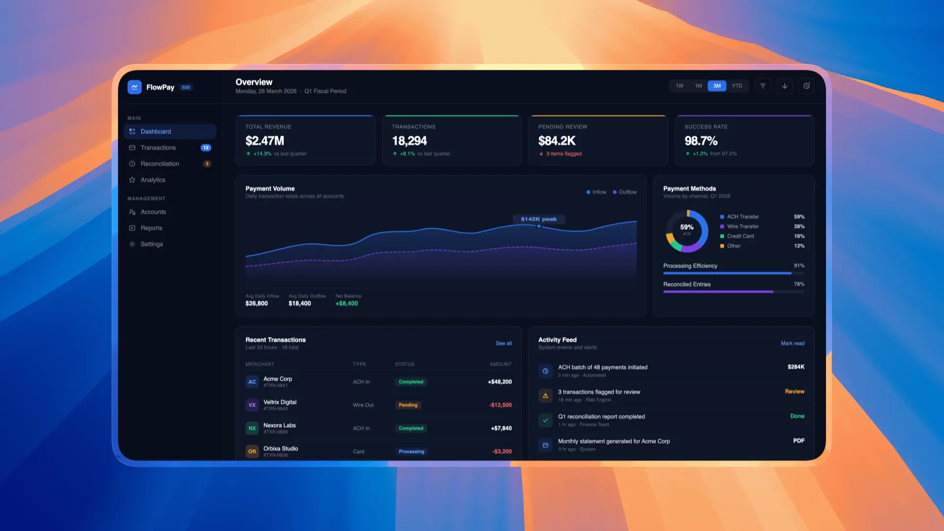
Clevrr AI - Root Cause Analysis
Designed an AI-powered Root Cause Analysis (RCA) experience that helps D2C brands move beyond dashboards to quickly identify the reasons behind changes in business performance.
Role
Duration
Tools
Team

About This Case Study
Part 1: How a simple client question led us from dashboards to whiteboards and the foundation of RCA.
Part 2: How we transformed that business logic into flows, wireframes, and the final RCA experience.
My Role
I worked as the Product Designer for Clevrr AI, leading the end-to-end design process for the RCA feature.
My responsibilities included problem discovery, user flow design, business logic mapping, wireframing, interaction design, high-fidelity UI design, and collaborating closely with founders and engineers to bring the experience to life.
The Question That Broke the Illusion
When we started building Clevrr AI, our goal was simple: help D2C brands make faster and better decisions using their business data. Naturally, we built dashboards — lots of them. The product looked complete. Then, one conversation changed everything.
“Our sales are down 30% compared to last week. How do we figure out why?”
We opened Clevrr and began jumping from the sales dashboard to marketing, then to product, customer, and fulfillment metrics, manually cross-referencing a massive web of variables:
ROAS
Conversion rates
Average Order Value (AOV)
Discount trends
Product performance
Delivery issues
Returning customer behavior
Spend allocation
An Uncomfortable Realization
The time it took us to find the root cause inside our own analytics product was almost equal to the time the client’s team spent manually switching between spreadsheets, Meta, Google Analytics, and Shopify. Businesses don’t struggle with seeing numbers; they struggle with understanding cause and action.
The Whiteboard Sessions
We completely stopped designing UI screens. Instead, we gathered around a whiteboard to map how revenue actually moves inside a D2C business, starting with one core question: “Why does revenue go up or down?”
Initially, we identified four major business drivers:
Orders
AOV
Fulfillment
Discounts
The Branching Effect
If Orders are down, you have to ask why — and that immediately forces you down several branches:
Lower traffic on the website
Poor conversion rates
Weak ad creatives
Inaccurate targeting
Checkout friction
Underperforming Meta campaigns
Every answer generated another “why,” and our whiteboard started looking like a massive decision tree. Root cause analysis is entirely non-linear.
Uncovering the Hidden Layers of Causation
Marketing Missteps: scaling weak campaigns or suffering from creative fatigue.
Operational Friction: inventory mismatches with active ads or delayed deliveries hurting repeat purchase rates.
Financial Erosion: aggressive discounting or low-quality traffic inflating ad spend.
Between the final sales drop and the actual root issue, there were often 4 to 5 layers of contributing factors.


The Paradigm Shift
That was the moment RCA stopped feeling like just another feature. We stopped thinking about building more charts, dashboards, filters, and reports.
Instead, I collaborated with the engineering team around a single question: How can we build a system that thinks through business problems the same way an experienced human operator would?
We shifted from displaying data to connecting events, explaining causation, and drastically reducing investigation time — helping teams move from “What happened?” to “Here’s why it happened.”

Sketching Different User Flows
After weeks of mapping revenue drivers, we had a giant decision tree. The challenge: how do we turn it into a product people can actually use? Before opening Figma, we lived on whiteboards mapping revenue trees, cause-and-effect branches, investigation paths, and user journeys.
Then we moved to notebooks for rapid sketching, answering tough structural questions:
Where exactly should a user start their investigation?
How many levels deep should we allow them to go?
How do users transition between different root causes?
What happens when multiple factors contribute to the same problem?
How do we prevent users from getting lost in a sea of data?
At this stage, speed mattered far more than visual aesthetics. We were focused entirely on the flow.

Moving into Wireframes
Complete RCA decision tree mapping every possible investigation path from revenue impact to the underlying business and campaign-level causes.
With the behavioral architecture finalized, we started wireframing to validate navigation paths, visual hierarchy, core interactions, and information architecture.
This low-fidelity validation helped us catch critical UX issues long before we spent time on visual design.


The First True RCA Experience
Once the wireframes proved stable, we stepped into high-fidelity UI exploration. Everything began coming together:
The interactive canvas
The data nodes
The step-by-step investigation flow
The contextual side panels
The deep drill-down experience
Defining the Core Functionalities
Only after the flows were locked did we start listing features, asking operational questions:
Should users be able to zoom in and out of a massive canvas freely?
How should interactive drill-downs work?
Should there be an automated AI summary to synthesize findings?
How do users compare metrics side-by-side?
How do teams navigate large RCA trees without getting lost?
How do they backtrack without losing context?
We were still strictly designing behavior, not visuals.
From Sketches to a Living RCA Product
The polished final screens were only a tiny fraction of the journey. The real work happened on whiteboards, notebook pages, flow diagrams, and endless debates about how people solve business problems.


Designed to Replicate a Thinking Process
We didn’t design RCA to be just another passive dashboard. We designed it to replicate a rigorous thinking process — guiding operators from a revenue change down to the campaign or operational issue behind it.
The Outcome
RCA redefined the trajectory of Clevrr AI. The future of analytics isn’t more dashboards — it’s intelligent systems that help businesses truly understand their decisions.
Key Learnings
Users don’t need more dashboards. They need answers.
Revenue changes are rarely caused by a single metric.
Root cause analysis is a journey of asking “Why?” until the actual issue is uncovered.
Most of the RCA work happened before Figma.
A great analytics experience guides users toward insights instead of making them connect the dots.
Every branch in the RCA flow should answer a question and lead closer to the root cause.
The best product ideas often come from real customer problems, not feature roadmaps.
Analytics should explain causation, not just report numbers.
Where It All Started
One simple client question — “Why are sales down?” — completely changed the direction of our product.